
반응형
Notice
Recent Posts
Recent Comments
Link
| 일 | 월 | 화 | 수 | 목 | 금 | 토 |
|---|---|---|---|---|---|---|
| 1 | ||||||
| 2 | 3 | 4 | 5 | 6 | 7 | 8 |
| 9 | 10 | 11 | 12 | 13 | 14 | 15 |
| 16 | 17 | 18 | 19 | 20 | 21 | 22 |
| 23 | 24 | 25 | 26 | 27 | 28 | 29 |
| 30 |
Tags
- 다중검정
- plot
- 통계
- 백분위 변환
- ttest
- python
- matplotlib
- spearman
- marketing
- data analysis
- python error plot
- cltv
- ecommerce data
- FWER
- 베이지안론
- box-cox변환
- 데이터 분석
- marketing insight
- E-Commerce
- python significance level
- 빈도주의론
- error bar plot
- Pearson
- p value plot
- Yeo-Johnsom 변환
- 시각화
- lifetimevalue
- 분위수 변환
- 데이터 시각화
- 고객가치분석
Archives
- Today
- Total
Data 공부
[데이터 시각화] Python - gradientbar(matplotlib) 본문
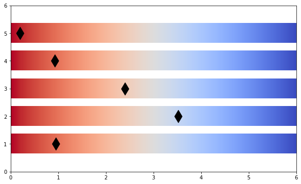
matplotlib 을 통해 Gradient Bar를 그리는 방법입니다.
예제 코드)
import matplotlib.pyplot as plt
import matplotlib.cm as cm
import matplotlib
from matplotlib.colors import Normalize
import pandas as pd
import numpy as np

def gradientbars(bars):
      ax = bars[0].axes
      lim = ax.get_xlim()+ax.get_ylim()
      for bar in bars:
          bar.set_zorder(1)
          bar.set_facecolor("none")
          x,y = bar.get_xy()
          w, h = bar.get_width(), bar.get_height()
          grad = np.atleast_2d(np.linspace(0,1*w/6,256))
          cmap = plt.get_cmap('coolwarm_r')
          ax.imshow(grad, extent=[x,x+w,y,y+h], aspect="auto", zorder=0,
                    norm=matplotlib.colors.NoNorm(vmin=0,vmax=1), cmap=cmap)
      ax.axis(lim)

plt.figure(figsize=(10, 6))
plt.xlim(0, 6)
plt.ylim(0, 6)
bar = plt.barh(Y,6,height=0.7, align='center', alpha=0.8) #temp data
gradientbars(bar)
plt.scatter(xarr, Y, s=300, color='k', alpha=1, marker="d",) #temp data
plt.show()
예제 PLOT)
반응형
'Data 공부 > 데이터 시각화' 카테고리의 다른 글
| [데이터 시각화] Python - Error bar plot 그리기 (significance level추가) (0) | 2023.06.16 |
|---|---|
| [데이터 시각화] Python - 방사형 그래프 (Radar Chart) 그리기 (0) | 2023.06.12 |
| [데이터 시각화] Python - text를 포함한 Radial Guage Chart 차트 (0) | 2023.06.12 |
| [데이터 시각화] Python - Correlation Plot(sns.jointplot) (0) | 2023.06.12 |
'Data 공부/데이터 시각화' Related Articles
more


Comments